Here’s something that confuses almost every new trader — and honestly, it confused us too when we were starting out.
You pull up a stock chart. The price looks like it’s crashing. Panic sets in. Then you switch to a different timeframe and suddenly… the same stock looks like it’s in a perfectly healthy uptrend. Nothing changed except your perspective. Same stock, same day, completely different story.
That disorienting experience is actually one of the most important lessons in day trading: the timeframe you choose to look at fundamentally changes what you see. And if you’re looking at the wrong timeframe — or worse, only looking at one — you’re making decisions with an incomplete picture.
If you’ve been following our Beginner’s Guide series, you’ve already learned to read candlestick charts, identify support and resistance, recognize basic patterns, use simple indicators, and understand why liquidity and volume matter. All of that knowledge lives on charts. But we haven’t talked about which version of the chart you should actually be watching.
That changes now. By the end of this article, you’ll understand exactly what timeframes are, which ones day traders use, why shorter isn’t always better, and — most importantly — you’ll walk away with a simple two-chart starter system you can use from day one.
What Is a Chart Timeframe?
A chart timeframe — sometimes called a “chart interval” or “period” — is simply the amount of time that each individual candle or bar on your chart represents.
If you’re on a 5-minute chart, every single candlestick you see captures five minutes of trading activity. The candle’s open is where the price was when those five minutes started, the close is where it ended, and the high and low show the extremes price reached during that window.
Switch to a 1-hour chart, and now each candle compresses a full hour of trading into one shape. Switch to a daily chart, and each candle represents an entire trading session — from the 9:30 AM open to the 4:00 PM close.
Here’s the key insight: the underlying price data is identical. Whether you’re looking at a 1-minute chart or a daily chart of the same stock on the same day, the price moved the exact same way. The difference is how much detail you’re seeing.
Think of it like a camera lens. Zoom all the way in on a photograph and you see every grain, every tiny imperfection, every fleck of dust. Zoom out, and suddenly you see the full landscape — the mountains, the river, the forest. The scene didn’t change. Your perspective did.
That’s exactly what timeframes do for price action. Zoom in (shorter timeframes) and you see every micro-move, every twitch. Zoom out (longer timeframes) and those twitches disappear, replaced by the bigger, more meaningful trends.
Neither view is “wrong.” But using the wrong one for your trading style is a guaranteed way to make bad decisions.

The Timeframes Available to Day Traders
Most charting platforms offer a wide range of timeframes. Here’s the full spectrum you’ll encounter, from shortest to longest, and who typically uses each one:
Ultra-Short (Seconds to 1-Minute)
The 1-minute chart prints a new candle every 60 seconds. Tick charts — which create a new candle after a set number of transactions rather than a set time — are even faster. These are the domain of scalpers: traders who dart in and out of positions within seconds to minutes, targeting tiny price movements. They’re extremely fast-paced, very noisy, and not where beginners should start. We introduce scalping as a strategy later in our Introduction to Scalping guide.
Short-Term (5-Minute and 15-Minute)
These are the bread and butter of most stock day traders. The 5-minute chart gives you enough detail to time entries and exits with precision while filtering out some of the random noise you’d see on a 1-minute chart. The 15-minute chart smooths things out further — each candle captures more data, so patterns and trends become clearer. Many day traders use one of these as their primary execution chart.
Medium-Term (30-Minute and 1-Hour)
The 30-minute and 1-hour charts offer a wider perspective on the trading day. Day traders don’t usually execute trades from these charts, but they use them as “context” charts — stepping back to see the bigger intraday picture. Is the stock trending up all morning? Consolidating in a range? The hourly chart answers these questions quickly without the clutter of shorter intervals.
Higher Timeframes (Daily, Weekly, Monthly)
The daily chart shows one candle per trading session. The weekly chart, one candle per week. The monthly, one per month. Day traders absolutely use the daily chart — not for execution, but for understanding the bigger trend the stock is in. Is the stock in a multi-week uptrend? Sitting at a major resistance level from last month? The daily chart reveals context that’s invisible on intraday charts.
Weekly and monthly charts are more relevant to swing traders and investors, but even day traders glance at them occasionally to understand where the stock sits in its longer-term story.
One thing to remember: each platform labels these slightly differently. You might see “M1” (1-minute), “M5” (5-minute), “H1” (1-hour), “D1” (daily), and so on. The concept is always the same — the number tells you how much time each candle covers.
Why Timeframe Choice Matters More Than You Think
Here’s where this gets practical. Your timeframe choice doesn’t just affect what you see — it affects virtually every aspect of your trading:
It changes the signals you receive.
A stock might show a clear breakout above resistance on a 5-minute chart. Switch to the 1-hour chart, and that “breakout” is just a minor blip in an ongoing downtrend. The patterns, the support and resistance levels you identified in our Support and Resistance guide, even the candlestick formations from our Candlestick Charts guide — they all look different depending on the timeframe you’re viewing.
It determines how many trading opportunities you see.
A 1-minute chart on an active stock might show dozens of potential setups in a single morning. A 15-minute chart on the same stock might show two or three. More isn’t necessarily better — but if you’re expecting frequent action on a longer timeframe, you’ll be frustrated. If you can’t handle the speed of a shorter one, you’ll be overwhelmed.
It affects your stop-loss placement and risk.
On a 1-minute chart, a “reasonable” stop-loss might be $0.10 below your entry. On a 15-minute chart, the equivalent stop — placed below the nearest support level — might be $0.50 away. Same stock, same moment in time, but the timeframe changes how much room you need to give the trade, which directly impacts your position sizing and potential loss. We cover position sizing math in depth in our Position Sizing for Beginners guide.
It shapes your emotional experience.
This one doesn’t get talked about enough. Shorter timeframes move fast. Every second matters. The candles whip up and down, and the temptation to react to every little movement is intense. Longer timeframes move more slowly, giving you more time to think, analyze, and breathe. Your personality and temperament should factor into which timeframe you trade — this isn’t just a technical decision, it’s a psychological one.
The Signal vs. Noise Tradeoff: Shorter Isn’t Always Better
New traders almost universally make the same mistake: they gravitate toward the shortest timeframes possible because they assume more data equals better decisions.
It doesn’t. In fact, it often means worse ones.
Here’s why. Every stock’s price fluctuates constantly during the trading day. Small buy orders, small sell orders, algorithms adjusting positions, high-frequency traders doing their thing — all of this creates what traders call noise: random, meaningless price movements that look like patterns but aren’t.
On a 1-minute chart, noise is everywhere. The candles jump erratically, create false breakouts, and form patterns that seem promising but dissolve within minutes. A beginner watching a 1-minute chart is like someone trying to navigate using a magnifying glass — they can see every blade of grass but have no idea which direction the path goes.
On a 15-minute chart, the same stock’s price action looks dramatically cleaner. The random noise gets compressed into larger candles, and what remains is the signal — the actual, meaningful trend and price structure. The tradeoff? You lose granularity. You can’t see the micro-moves anymore. But for most day traders — and definitely for beginners — that’s a feature, not a bug.
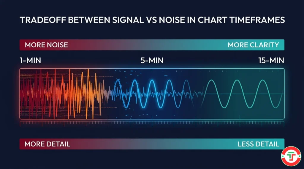
Here’s how the tradeoff plays out across the most common day trading timeframes:
1-Minute Chart: Maximum detail, maximum noise. Every micro-move is visible. Requires extremely fast decision-making and high discipline. Generates the most signals — but also the most false signals. Best suited for experienced scalpers, not beginners.
5-Minute Chart: Strong balance of detail and clarity. Filters out much of the random noise while keeping enough resolution to time entries and exits precisely. This is our team’s recommended starting point for day trading execution.
15-Minute Chart: Cleaner trends, fewer signals, wider context. Great for identifying the intraday trend direction and key levels. Less stressful than the 5-minute. Some day traders use this as their primary chart, especially when watching multiple stocks simultaneously.
1-Hour Chart: Broad intraday context. You can see the entire morning session in a handful of candles. Useful as a “zoom out” reference chart, but too slow for most day trading entries and exits.
The takeaway? Start wider, then zoom in only as far as you need to. You can always add detail. But if you start with too much detail and not enough context, you’ll be lost before you even place a trade.
The Best Chart Timeframes for Day Trading Stocks
After years of testing and teaching, our team has found that most successful stock day traders settle into one of two timeframe combinations:
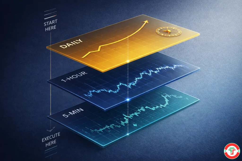
Combo 1: The Standard Day Trading Setup
- Context chart: Daily (for the bigger trend and major support/resistance levels)
- Execution chart: 5-minute (for timing entries and exits)
- Optional detail chart: 1-minute (for fine-tuning entries on volatile stocks)
This is the combination we recommend for beginners. The daily chart gives you the “story so far” — is this stock in an uptrend, downtrend, or consolidation over the last few weeks? Are there major price levels nearby that might act as magnets or walls? You check this before the market opens as part of your pre-market preparation.
Then during the trading session, the 5-minute chart is your cockpit. You watch price action unfold, identify patterns, manage entries and exits, and place your stop-losses based on what this chart shows you.
If you need more precision — maybe the stock is moving fast and you want to time an entry within a specific 5-minute candle — you can temporarily drop to the 1-minute chart. But you always return to the 5-minute as your home base.
Combo 2: The Wider Day Trading Setup
- Context chart: Daily + 1-hour (for trend and intraday structure)
- Execution chart: 15-minute (for entries and exits)
Some day traders prefer a slower pace with fewer but higher-quality setups. The 15-minute chart as a primary execution chart means fewer signals per day — maybe one to three good opportunities — but cleaner ones with less noise. This combo works especially well for traders who watch a larger watchlist of stocks and can’t stare at a single 5-minute chart all day.
Which Combo Should You Choose?
For most beginners, start with the Daily + 5-minute combination. It offers the best balance of context, detail, and manageable speed. As you gain experience and discover your natural trading rhythm, you can adjust — moving toward faster charts if you want more action, or slower ones if you prefer fewer, more deliberate trades.
The critical point: pick a combination and stick with it for at least 30 trades before switching. Constantly changing timeframes is one of the fastest paths to inconsistency. You need enough repetition on the same setup to learn whether the timeframe fits your personality and strategy — not just whether it worked on today’s one trade.
Your Beginner Starter Combo: Daily + 5-Minute
Let’s walk through exactly how a beginner would use the Daily + 5-minute combination in practice. Think of this as your first day trading “workflow” for chart analysis.
Step 1: Check the Daily Chart (Pre-Market)
Before the market opens, pull up the daily chart of any stock on your watchlist. You’re looking for context — not trade signals. Ask three questions:
“What’s the trend?” Are the candles making higher highs and higher lows (uptrend)? Lower highs and lower lows (downtrend)? Or chopping sideways in a range? This tells you the stock’s general direction and whether you should be looking for long trades, short trades, or staying away.
“Where are the big levels?” Look for obvious support and resistance zones — prices where the stock has repeatedly bounced or stalled. These levels from the daily chart carry enormous weight. If the stock is approaching a major daily resistance level, that changes how you trade it on the 5-minute chart during the session.
“How does today’s pre-market action fit the bigger picture?” If the stock gapped up 5% this morning and it’s approaching a daily resistance level — that’s useful context. If it’s gapping down into a daily support level — that’s a different setup entirely.
This daily chart review should take 2–3 minutes per stock. You’re not drawing 15 trendlines. You’re getting the big picture.
Step 2: Switch to the 5-Minute Chart (During the Session)
Once the market opens, your 5-minute chart becomes the primary screen. This is where the action happens. You’re watching for:
- Price approaching key levels you identified on the daily chart
- Intraday patterns forming (breakouts, pullbacks, reversals)
- Volume confirming moves — something you learned in our previous article on Liquidity and Volume
- Your indicator signals — covered in our Basic Indicators guide
Your entries, exits, and stop-losses are all based on what the 5-minute chart shows you. But here’s the crucial part: you never forget the daily chart context. If the daily chart showed a massive resistance level at $50, and your 5-minute chart shows the stock rallying toward $49.90 — you know there’s a potential wall ahead that many other traders are watching too.
Step 3: Reference the Daily When the 5-Minute Gets Confusing
There will be moments during the day when the 5-minute chart looks chaotic — price is chopping, signals are contradicting each other, and nothing makes sense. That’s your cue to zoom out to the daily chart and ask: “Has anything changed about the bigger picture?”
Usually, the answer is no. The daily trend is still intact, and the 5-minute chaos is just noise within a larger, orderly structure. That perspective alone can save you from making emotional, reactive trades.
Introduction to Multi-Timeframe Analysis (The Top-Down Approach)
What we just described — checking the daily chart first, then zooming into the 5-minute for execution — is actually the foundation of a powerful technique called multi-timeframe analysis (MTFA).
The core idea is simple: always start from the higher timeframe and work down. This is called the “top-down approach,” and it’s how professional traders think. The higher timeframe tells you what to trade (direction, bias, major levels). The lower timeframe tells you when to trade (entry timing, stop placement, execution).
Why top-down and not bottom-up? Because if you start on the 5-minute chart and spot a beautiful bullish pattern, but the daily chart shows the stock is in a brutal downtrend hitting resistance — your “beautiful pattern” is actually a trap. You’re buying into a headwind. The higher timeframe provides the context that gives lower-timeframe signals their meaning.
The full concept of multi-timeframe analysis — including how to use three timeframes together, how to handle conflicting signals, and specific combinations for different strategies — is something we dedicate an entire article to. When you’re ready to go deeper, see our Multi-Timeframe Analysis guide.
For now, the beginner version is enough: Daily for direction. 5-minute for execution. Always check the bigger picture first.
The 5 Most Common Timeframe Mistakes Beginners Make
After working with countless new traders, our team sees the same errors come up over and over. Avoid these, and you’re already ahead of most beginners.
Mistake #1: Starting on the 1-Minute Chart
This is the single most common mistake, and it’s driven by the belief that more detail means more control. It doesn’t. The 1-minute chart is the noisiest, most stressful, most signal-heavy timeframe you can trade. It requires lightning-fast decisions, ironclad discipline, and experience reading price action that beginners simply haven’t developed yet. Starting here is like learning to drive in a Formula 1 car. The 5-minute or 15-minute chart gives you the training ground you need.
Mistake #2: Only Looking at One Timeframe
If you’re making every decision based on a single chart, you’re missing context. That perfect 5-minute breakout might be running straight into a brick wall on the daily chart. That “crash” on the 5-minute might be a normal, healthy pullback in a strong daily uptrend. A single timeframe gives you detail without context — and context is what keeps you from taking bad trades.
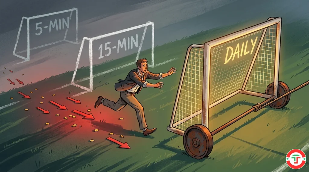
Mistake #3: Switching Timeframes Mid-Trade
You enter a trade based on the 5-minute chart. It goes slightly against you. So you switch to the 15-minute chart and think “see, it still looks fine on this timeframe.” Then it drops more, so you switch to the daily chart and convince yourself the trade is okay because the “bigger picture” is bullish. This is called timeframe hopping, and it’s a form of rationalization. Your trade was based on the 5-minute chart. Your stop-loss should be based on the 5-minute chart. If the 5-minute setup fails, the trade is over — regardless of what other timeframes show.
Mistake #4: Using Too Many Timeframes at Once
Some beginners try to watch the 1-minute, 5-minute, 15-minute, hourly, AND daily chart simultaneously. The result? Paralysis. Each chart is telling a slightly different story, and trying to reconcile all of them in real time leads to confusion, hesitation, and missed opportunities. Two timeframes is the sweet spot for beginners. Three is the maximum for experienced traders. More than that creates diminishing returns — and increasing anxiety.
Mistake #5: Choosing a Timeframe That Doesn’t Match Their Personality
A patient, analytical trader who hates feeling rushed will be miserable on a 1-minute chart. An impatient, action-oriented trader who needs constant stimulation will be bored stiff on a 15-minute chart and start forcing bad trades out of boredom. Your timeframe needs to match your temperament. If you find yourself consistently stressed, overwhelmed, or bored on your current timeframe — it might not be the market that’s the problem. It might be the lens you’re looking through.
What’s Next in Your Day Trading Journey
Now that you understand how timeframes work and which ones matter for day trading, it’s time to learn about one of the most important tools that lives on those charts — the VWAP. The Volume Weighted Average Price is the single most referenced intraday indicator among professional day traders, and understanding it will add a powerful layer of context to every 5-minute chart you read.
→ Next Article: VWAP Explained: The Day Trader’s Most Important Indicator
Frequently Asked Questions
What is the best chart timeframe for day trading?
Quick Answer: There’s no single “best” timeframe — but for stock day trading, the 5-minute chart is the most popular execution timeframe, paired with the daily chart for context.
The 5-minute chart strikes the best balance between detail and clarity for most day traders. It filters out much of the random noise found on 1-minute charts while still giving you enough resolution to time entries and exits precisely. Pair it with a daily chart for bigger-picture trend context, and you have a reliable two-chart combination that works across most strategies and experience levels.
Key Takeaway: Start with the Daily + 5-minute combo. Adjust as you gain experience and discover your trading rhythm.
Why shouldn’t beginners use the 1-minute chart?
Quick Answer: The 1-minute chart is the noisiest, fastest-moving timeframe and generates the most false signals — making it overwhelming for traders who haven’t yet developed fast pattern recognition and rock-solid discipline.
On a 1-minute chart, random price fluctuations look like meaningful moves. Beginners react to every candle, overtrade, and get chopped up by noise they mistake for signals. The 5-minute chart filters out much of this randomness while still providing enough detail for precise execution. Think of it this way: you wouldn’t learn to drive on a racetrack. The 5-minute chart is your side street — fast enough to learn, slow enough to survive.
Key Takeaway: Master the 5-minute chart first. You can always move to shorter timeframes later when you have the experience to handle the speed.
What is multi-timeframe analysis?
Quick Answer: Multi-timeframe analysis means looking at the same stock across two or three different chart timeframes to get both the big-picture context and the precise execution detail.
The concept follows a “top-down” approach: check the higher timeframe first to understand the overall trend and major levels, then zoom into a lower timeframe to find your specific entry and exit. For day traders, this typically means checking the daily chart for direction and the 5-minute chart for execution. It prevents you from taking trades that look good on one timeframe but are actually fighting the bigger trend. We cover the full technique in our Multi-Timeframe Analysis guide.
Key Takeaway: Always start with the bigger picture and work down. The higher timeframe gives meaning to the lower timeframe’s signals.
How many timeframes should I watch at once?
Quick Answer: Two for beginners, three maximum for experienced traders. More than that creates analysis paralysis without improving your results.
Two timeframes — one for context and one for execution — give you everything you need to make well-informed decisions. Adding a third can refine your entries, but going beyond that usually leads to conflicting signals, hesitation, and confusion. Professional traders don’t watch seven charts at once. They pick a clear combination, learn it deeply, and stick with it.
Key Takeaway: Start with two timeframes (Daily + 5-minute). Add a third only when you’re consistently profitable with two.
Does the timeframe I use affect my risk per trade?
Quick Answer: Yes, significantly. Shorter timeframes allow tighter stop-losses (less risk per trade but more frequent stops), while longer timeframes require wider stops (more risk per trade but fewer false triggers).
On a 5-minute chart, a reasonable stop-loss might be $0.15 below your entry based on the nearest support level. On a 15-minute chart, that same support level might be $0.40 away. Your timeframe directly impacts stop placement, which impacts position sizing, which impacts your risk per trade. This is why understanding timeframes and position sizing go hand-in-hand. For the math on calculating position sizes, see our Position Sizing guide.
Key Takeaway: Shorter timeframes = tighter stops but more noise. Longer timeframes = wider stops but cleaner signals. Adjust position size accordingly.
What is timeframe hopping and why is it dangerous?
Quick Answer: Timeframe hopping is switching to a different timeframe mid-trade to justify staying in a losing position — and it’s one of the most common ways traders let small losses become big ones.
Here’s how it works: you enter based on a 5-minute chart signal, the trade goes against you, and instead of honoring your stop-loss, you switch to the 15-minute or daily chart where the trade “still looks okay.” You’re not analyzing — you’re rationalizing. Your trade thesis was based on the 5-minute chart. If that timeframe says you’re wrong, you’re wrong. Switching lenses to avoid the truth is a psychological trap, not a strategy.
Key Takeaway: Set your timeframe before the trade. If the trade fails on that timeframe, exit. No exceptions.
Do day traders need to look at daily or weekly charts?
Quick Answer: Yes — the daily chart is essential context for day traders, even though you’d never execute a day trade based on it. Weekly charts are optional but occasionally useful.
The daily chart shows you where the stock has been over the past weeks and months. Major support and resistance levels on the daily chart are watched by thousands of traders and institutions, which means they directly affect intraday price action. Ignoring the daily chart means you’re trading without knowing the terrain. You don’t need to stare at it all day — a 2-3 minute review during pre-market preparation is enough.
Key Takeaway: Always check the daily chart before trading any stock. It takes minutes but prevents you from trading into invisible walls.
Which timeframe shows the “real” trend?
Quick Answer: All of them — and none of them. Every timeframe shows a real trend at that particular scale. The question isn’t which is “real,” but which is relevant to your trading style.
A stock can be in a downtrend on the 5-minute chart (it’s been selling off for the last two hours), an uptrend on the daily chart (it’s rallied 15% over two weeks), and a downtrend on the weekly chart (it’s been falling for three months). All three trends are real. For a day trader, the daily and intraday trends matter most. For an investor, the weekly and monthly trends matter most. Conflicting trends across timeframes are normal — they’re not a bug, they’re a feature that gives you context.
Key Takeaway: No single timeframe has a monopoly on truth. Use higher timeframes for direction and lower timeframes for execution.
Can I use the same indicators on different timeframes?
Quick Answer: Yes, but they behave differently. An indicator that works well on a daily chart might generate too many false signals on a 1-minute chart because of the increased noise.
Moving averages, RSI, MACD — all the indicators you learned about in our Basic Indicators guide — can be applied to any timeframe. But their usefulness changes. A 20-period moving average on a daily chart smooths 20 days of data and shows a meaningful trend. A 20-period MA on a 1-minute chart smooths 20 minutes — barely enough to filter noise. The same indicator, very different information. This is something we explore further in our Moving Averages guide.
Key Takeaway: Indicators work on any timeframe, but choose settings appropriate for the chart you’re using. What works on a daily chart won’t necessarily work on a 5-minute chart.
How do I set up multiple timeframes on my charting platform?
Quick Answer: Most platforms let you open multiple chart windows of the same stock, each set to a different timeframe, either side by side or stacked.
In most charting software — including free platforms like TradingView — you can create a layout with two or more charts showing the same stock. Put your daily chart on one panel and your 5-minute chart on the other. Some platforms even let you link the charts so that when you type in a new ticker symbol, all charts update simultaneously. This multi-chart layout is a core feature to look for when choosing your charting tools. We compare the best options in our Day Trading Toolkit.
Key Takeaway: Set up a two-panel layout with your daily and 5-minute charts side by side. It takes minutes to configure and permanently improves your analysis.
Disclaimer
The information provided in this article is for educational purposes only and should not be considered financial advice. Day trading involves substantial risk and is not suitable for every investor. Past performance is not indicative of future results.
For our complete disclaimer, please visit: https://daytradingtoolkit.com/disclaimer/
Article Sources
Our team builds every article on a foundation of verified, authoritative research. Here are the primary sources we referenced and recommend for further reading on chart timeframes and multi-timeframe analysis.
- Investopedia: Time Frame — The standard reference for financial definitions, providing a clear explanation of how timeframes work in trading and which ones suit different trading styles.
- Charles Schwab: Technical Analysis Education — Schwab’s educational resources for active traders cover how timeframe selection affects technical indicator signals and trade execution quality.
- StockCharts ChartSchool: Introduction to Technical Analysis — StockCharts’ free education hub provides foundational knowledge on chart types, timeframes, and how different intervals affect pattern recognition.
- Corporate Finance Institute: Multiple Time Frame Analysis — CFI explains the multi-timeframe approach including Alexander Elder’s Triple Screen system and how traders combine higher and lower timeframes for better decisions.
- Fidelity: Active Investor Learning Resources — Fidelity’s active investor education covers technical analysis fundamentals including how timeframe selection influences trend identification and signal reliability.
- Brian Shannon, Technical Analysis Using Multiple Timeframes (McGraw-Hill) — One of the most widely recommended books on multi-timeframe analysis, providing a practical framework for aligning trades across different chart intervals.


