You’ve learned to read candlesticks. You know how to find support and resistance levels. Now here’s where those skills start working together — because chart patterns are what happen when candlesticks, support, resistance, buyers, and sellers combine into recognizable shapes that hint at what’s coming next.
But here’s the trap most beginners fall into: they Google “chart patterns,” find a guide listing 30 or 40 different formations, and immediately feel overwhelmed. Symmetrical triangles, cup and handles, rising wedges, broadening tops, Quasimodos — the list goes on and on. And the result? Analysis paralysis. You end up seeing patterns everywhere and trusting none of them.
We’re going to take the opposite approach. In this guide, we’ll teach you exactly 6 chart patterns — the 6 that appear most frequently in day trading and give you the most bang for your learning investment. Three continuation patterns that signal “the trend isn’t done yet,” and three reversal patterns that signal “the trend is about to flip.” That’s it. Master these 6, and you’ll have a foundation that covers the vast majority of what you’ll see on any given trading day.
More importantly, we’ll explain why each pattern forms — the psychology behind the shape — because once you understand the human behavior driving these patterns, you’ll start recognizing them intuitively instead of trying to memorize shapes from a cheat sheet.
What Are Chart Patterns and Why Should You Care?
A chart pattern is a recognizable shape or formation that appears on a price chart when the collective behavior of buyers and sellers creates a predictable visual structure. Think of it this way: if individual candlesticks are words, chart patterns are sentences. They tell a bigger story about what’s happening in the market over minutes, hours, or days.
Why do chart patterns matter for day traders? Because they compress a complex situation — thousands of traders making buy and sell decisions — into a visual shorthand that helps you anticipate what’s likely to happen next. Not what will happen — what’s likely to happen. That’s a critical distinction.
Chart patterns work for the same reason support and resistance levels work: collective psychology. When enough traders recognize the same pattern forming, they act on it — placing buy orders, sell orders, and stop-losses at predictable locations. That collective action becomes a self-fulfilling prophecy, just like the support and resistance levels we covered in our previous guide.
Thomas Bulkowski, a researcher who spent decades analyzing over 200,000 chart pattern occurrences across thousands of stocks, found that many common patterns demonstrate statistically significant success rates — some exceeding 70% when properly identified and confirmed. His Encyclopedia of Chart Patterns remains the gold standard for data-backed pattern analysis. That’s not a guarantee, but it’s a meaningful edge — and in trading, consistent edges are how you survive.
Here’s what you need to understand from the start: chart patterns are probability tools, not crystal balls. Every pattern can fail. Some will fail spectacularly. The goal isn’t to find a pattern that works 100% of the time — it’s to identify high-probability setups and manage your risk when you’re wrong. We’ll cover both sides.
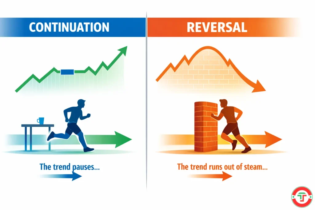
The Two Categories Every Trader Must Know: Continuation vs. Reversal
Before we look at any specific pattern, you need the organizing framework that makes all chart patterns easier to understand. Every pattern falls into one of two categories:
Continuation patterns signal that the current trend is likely to continue after a brief pause. The market is catching its breath — consolidating — before the next move in the same direction. Think of a runner stopping at a water station during a marathon. They haven’t quit the race. They’re resting before continuing in the same direction.
Reversal patterns signal that the current trend is likely to reverse — to change direction. The buyers who were in control are losing their grip, or the sellers who were dominating are running out of steam. Think of that same runner reaching a dead end and turning around.
This two-category framework is powerful because it simplifies your decision-making. When you spot a pattern forming, the first question is always: “Is this a continuation or a reversal?” That single answer tells you which direction the next move is likely to go — and which side of the trade you want to be on.
A quick word of caution: some patterns can act as either continuation or reversal depending on context. Triangles, for example, can break in either direction. Context matters — the broader trend, volume, and where the pattern forms relative to support and resistance all influence the outcome. We’ll flag these nuances as we go.
3 Continuation Patterns That Signal “The Trend Isn’t Done Yet”
These patterns form during a pause or consolidation within an existing trend. They’re telling you: “The buyers (or sellers) are still in control. They’re just taking a breather.”
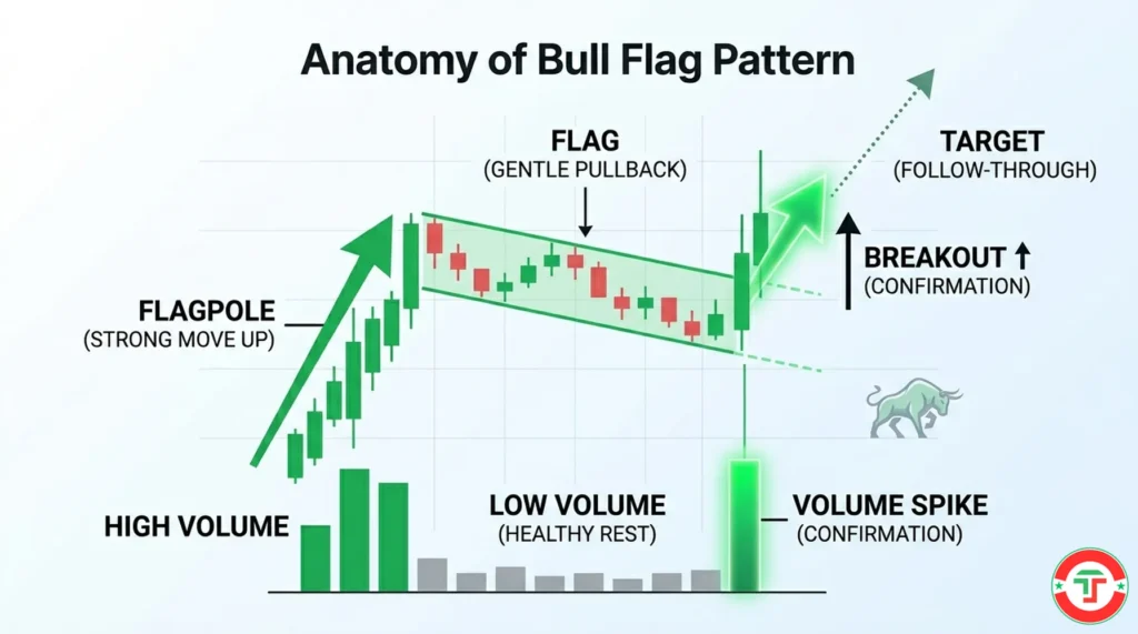
The Bull Flag
What it looks like: A strong, sharp move upward (the “flagpole”), followed by a brief, gentle pullback that drifts slightly downward or sideways (the “flag”). On a chart, it literally looks like a flag hanging from a pole. The pullback typically forms a small downward-sloping channel made of a few lower highs and lower lows.
Why it forms (the psychology): Imagine a stock that just surged 10% on big news. Early buyers are sitting on quick profits. Some of them sell to lock in gains — that selling creates the pullback. But here’s the key: the pullback is shallow and orderly. It doesn’t collapse. Why? Because new buyers are stepping in on the dip, absorbing the selling pressure. The brief pullback is profit-taking, not panic.
When the profit-takers are done selling and new buyers overwhelm them, the stock breaks above the flag and resumes its upward move — often with a surge of volume. That breakout is the signal.
What to watch for:
- The flagpole should be strong and steep — driven by high volume
- The flag (pullback) should drift gently against the trend on decreasing volume — this signals a healthy pause, not a reversal
- The pullback should retrace no more than roughly 50% of the flagpole — if it pulls back deeper, the pattern weakens
- The breakout above the flag’s upper boundary should come with increasing volume
Why beginners should learn this first: The bull flag is arguably the most popular day trading pattern for a reason. It appears frequently on intraday charts, especially in momentum stocks — the kind that show up on your scanner moving fast on high volume. Research from Samurai Trading Academy’s backtesting of over 200,000 patterns found that flag patterns reach their measured targets around 69% of the time, making them one of the more reliable continuation setups.
The Bear Flag
What it looks like: The exact mirror image of a bull flag. A sharp, steep move downward (the flagpole), followed by a brief rally or sideways drift upward (the flag). It looks like an upside-down flag.
Why it forms (the psychology): A stock drops hard. Short sellers and early bears take profits by buying back their shares — that buying creates the small upward drift. But the underlying selling pressure hasn’t changed. The rally is weak, shallow, and on low volume. When the brief bounce exhausts itself, sellers regain control and the stock breaks below the flag’s lower boundary, continuing its downward move.
What to watch for:
- The same rules apply in reverse: steep flagpole down on high volume, gentle upward drift on low volume, breakdown below the flag on expanding volume
- Bear flags can be trickier for beginners because shorting — profiting from a stock’s decline — requires a margin account and carries unique risks. For now, understanding the pattern is what matters. Recognizing a bear flag on a stock you own tells you to get out, not hold and hope
The bull and bear flag together: Once you understand one, you understand both. They’re the same psychological story — a brief pause in a strong trend caused by profit-taking, followed by a resumption of the trend. The direction is just flipped.
The Triangle
What it looks like: Price action narrows into a tighter and tighter range, creating a triangular shape on the chart. The highs get lower, the lows get higher (or one side stays flat while the other converges), and the price gets squeezed into a smaller and smaller space until it “breaks out” in one direction.
There are three main types:
Ascending triangle: A flat resistance level at the top with rising lows pushing up from below. It looks like the buyers keep pushing higher each time they pull back, while sellers hold firm at one price. This pattern is typically bullish — the rising lows signal increasing buying pressure that’s likely to eventually overcome the flat resistance.
Descending triangle: A flat support level at the bottom with falling highs pressing down from above. This is the bearish mirror — sellers are pushing lower each time while buyers hold firm at one price. Eventually, the support gives way.
Symmetrical triangle: Both sides converge equally — lower highs AND higher lows squeeze price into a tightening range. This pattern is the most ambiguous because it can break in either direction. Context matters: if the preceding trend was up, a symmetrical triangle more often breaks to the upside (continuation), and vice versa. But it’s not guaranteed.
Why triangles form (the psychology): Triangles represent a battle between buyers and sellers that’s reaching a climax. Think of it as two walls closing in — at some point, there’s no room left, and one side has to give. The narrowing range shows that both sides are testing each other, but the equilibrium is unstable. When the breakout happens, the trapped energy releases and price often moves sharply in the breakout direction.
What to watch for:
- The breakout is the trade — not the triangle itself. Don’t try to predict which direction it will break. Wait for it.
- Volume should decrease as the triangle forms (energy building) and spike on the breakout (energy releasing)
- Breakouts that occur roughly two-thirds of the way through the triangle (measured from left to right) tend to be more reliable than very late breakouts near the apex
- False breakouts are common with triangles — this is where volume confirmation becomes essential
3 Reversal Patterns That Signal “The Trend Is About to Flip”
Reversal patterns tell you that the dominant side — buyers or sellers — is losing control. These patterns typically need more time to develop than continuation patterns, because reversing a trend requires a genuine shift in market sentiment.
The Double Top
What it looks like: Price rises to a certain level, pulls back, rises to roughly the same level again, and then fails to break through. On a chart, it looks like the letter “M” — two peaks at nearly the same price with a valley between them.
Why it forms (the psychology): The first time price hits the high and pulls back, it creates a resistance level. Traders remember that price. When price rallies back to that same level, sellers who missed their chance to sell the first time are ready. Traders who bought at the top the first time and held through the pullback are thinking, “I’m not making that mistake again — I’m selling this time.” And new short sellers smell an opportunity. That concentrated selling pressure at the same price level creates the second top — and when buyers can’t push through, the pattern completes.
The “neckline” — the support level at the bottom of the valley between the two peaks — is the key level. When price breaks below this neckline, the double top is confirmed and a downward move is expected.
What to watch for:
- The two peaks should reach similar (not necessarily identical) price levels — within a few percent of each other
- Volume often decreases on the second peak compared to the first — a sign that buying enthusiasm is fading
- The pattern is not confirmed until the neckline breaks. Many traders jump the gun and short after the second top before the neckline breaks — that’s premature and risky
- The expected move after a neckline break is roughly equal to the distance from the peaks to the neckline, measured downward from the break point
The Double Bottom
What it looks like: The mirror image of the double top. Price falls to a certain level, bounces, falls to roughly the same level again, and then bounces harder. On a chart, it looks like the letter “W” — two valleys at nearly the same price with a peak between them.
Why it forms (the psychology): The first drop creates a support level. When price falls back to that same level, buyers who recognized the previous bounce are waiting. Traders who missed the first bounce are determined to buy this time. Short sellers who profited from the decline start covering their positions (buying back shares), adding more buying pressure. The collective behavior creates a floor — and when price breaks above the neckline (the peak between the two bottoms), the reversal is confirmed.
Research across large datasets has shown that double bottoms can be slightly more effective than double tops as reversal patterns, with target hit rates approaching 78% for double bottoms compared to roughly 75% for double tops in certain studies. The difference isn’t dramatic, but it’s worth noting.
What to watch for:
- Same rules as the double top, reversed: similar valley levels, decreasing volume on the second test, and confirmation only when the neckline breaks upward
- The second bottom doesn’t have to be exact — it can slightly undershoot or overshoot the first. What matters is that the general area holds
- False double bottoms happen when price bounces at the second low but fails to break the neckline. Without the neckline break, you don’t have a confirmed pattern
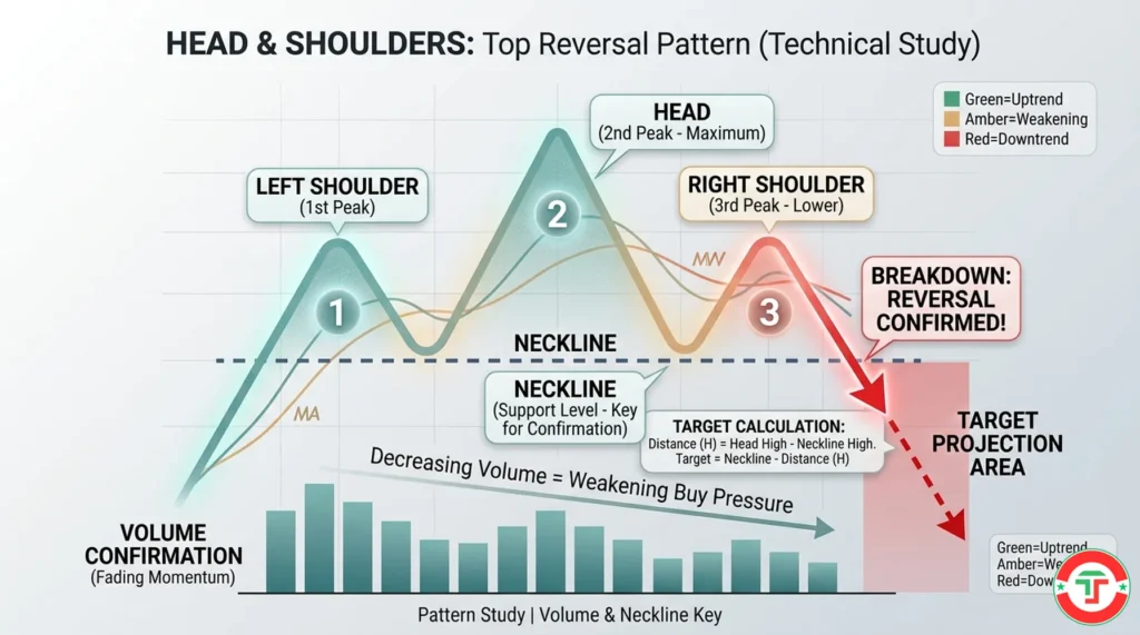
The Head and Shoulders
What it looks like: Three peaks in a row — a smaller peak (left “shoulder”), a taller peak (the “head”), and another smaller peak roughly the same height as the first (right “shoulder”). A line drawn across the bottoms of the two valleys between the peaks forms the “neckline.” It looks like a person’s silhouette — two shoulders with a head sticking up between them.
Why it forms (the psychology): This pattern tells the story of a trend losing momentum in three distinct acts.
Act 1 — Left shoulder: The uptrend is healthy. Price rises to a new high, pulls back, and buyers push it higher again. Normal trend behavior.
Act 2 — The head: Price makes an even higher high — the trend seems strong. But then it pulls back to roughly the same level as the previous pullback. So far, nothing alarming.
Act 3 — Right shoulder: Here’s where the story changes. Price rallies again, but this time it fails to reach the previous high. It stalls at roughly the same level as the first peak — forming the right shoulder. This failure to make a new high is the warning sign. The buyers tried and couldn’t push price as high as before. Momentum is fading.
When price then breaks below the neckline, the pattern is confirmed. The buyers have exhausted themselves, and sellers take control.
Thomas Bulkowski’s research found the head and shoulders pattern to be one of the more reliable reversal formations — with some studies showing success rates around 89% when properly confirmed. That makes it one of the highest-probability patterns you can learn.
What to watch for:
- The head must be the highest peak; the two shoulders should be at roughly similar heights
- Volume typically decreases from left shoulder to head to right shoulder — each rally has less buying power behind it
- The neckline doesn’t have to be perfectly horizontal — it can slope slightly up or down
- Confirmation happens when price breaks below the neckline, ideally on increasing volume
- The inverse head and shoulders (three valleys with the middle one deepest) is the bullish version — it signals a reversal from a downtrend to an uptrend and follows the same logic in reverse
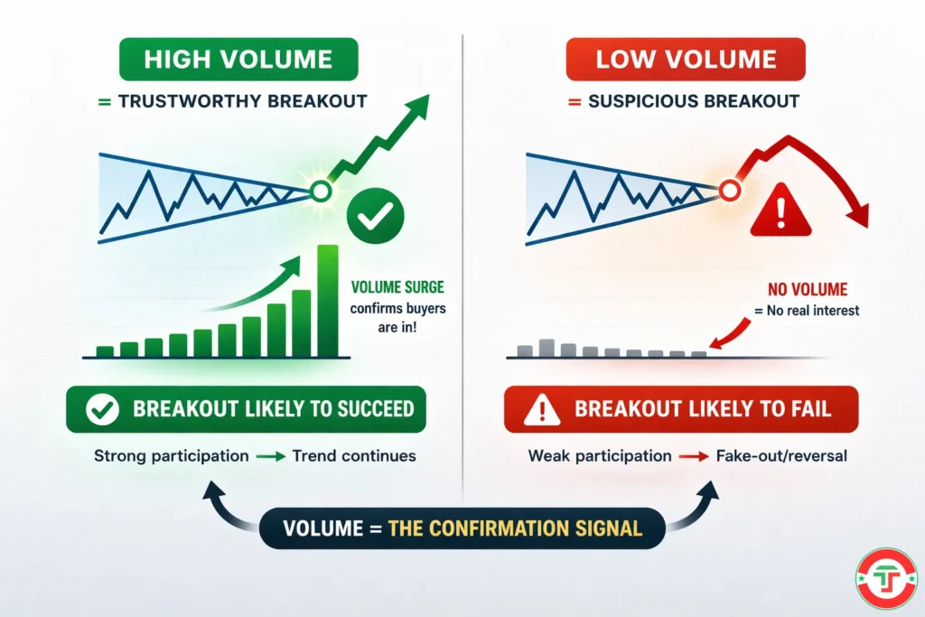
Why Volume Is the Pattern’s Lie Detector
We’ve mentioned volume with every pattern, and there’s a reason: volume is the single most important confirmation tool for chart patterns. Without volume, you’re guessing. With it, you’re reading conviction.
Here’s the principle: patterns are confirmed by volume; they’re undermined by the lack of it.
During a bull flag, volume should decrease in the flag (low participation = healthy rest) and spike on the breakout (high participation = real buyers). If volume stays flat during the breakout, be skeptical — the “breakout” might lack the muscle to sustain itself.
During a head and shoulders, volume should progressively decrease from left shoulder to head to right shoulder. That declining volume tells you each rally has fewer believers behind it. If volume increases on the right shoulder, the pattern might not be what you think.
For triangles, volume should contract as the pattern narrows (the coiling spring) and expand sharply on the breakout (the spring releasing).
The rule of thumb: a breakout on high volume is trustworthy. A breakout on low volume is suspicious. This isn’t foolproof, but it dramatically improves your odds.
We cover volume analysis in much more depth in our Liquidity and Volume guide and our dedicated Volume Analysis guide. For now, just remember: volume is the pattern’s lie detector. Always check it.
Why Patterns Fail: False Breakouts and How to Protect Yourself
Every pattern you’ve just learned can fail. This isn’t a disclaimer we’re tacking on — it’s one of the most important things we’ll tell you in this entire article. False breakouts — where price appears to break out of a pattern only to reverse back inside — are common, frustrating, and entirely normal.
Why false breakouts happen:
First, patterns are probability tools with imperfect hit rates. Even the best patterns work roughly 70–80% of the time in ideal conditions. That means 2–3 out of every 10 trades will fail even if you identify the pattern perfectly.
Second, institutional traders and algorithms know that retail traders cluster their orders around obvious pattern levels. Sometimes, price will push just past a breakout level — triggering all those buy orders — only to reverse sharply. This is called a “stop hunt” or “shakeout,” and it’s a normal part of how markets work.
Third, context matters. A bull flag forming in a strong uptrend with market-wide momentum has a much higher probability of working than the same bull flag forming in a choppy, directionless market. The pattern doesn’t exist in a vacuum — it exists within a broader market environment.
How to protect yourself:
Wait for confirmation. Don’t jump in the moment price touches a breakout level. Wait for a candlestick to close beyond the pattern boundary. A candle that pokes through resistance briefly but closes back inside is not a breakout — it’s a test.
Require volume. As we discussed, a breakout without volume is a breakout you shouldn’t trust. Volume is the difference between a genuine move and a head fake.
Use stop-losses — always. If a pattern fails, you need a predetermined exit point that limits your loss. Our What is a Stop-Loss Order guide covers this in detail, but the basic idea is simple: decide before you enter how much you’re willing to lose, place your stop at a logical level (usually just beyond the pattern’s boundary on the opposite side), and never move it further away.
Accept the failure rate. This might be the hardest part. You will have patterns fail on you. You’ll follow every rule, wait for confirmation, check the volume — and the trade will still go against you. That’s trading. The professionals don’t win every trade; they win enough trades with favorable risk/reward to be profitable overall. Risk management — covered extensively in our Introduction to Risk Management guide — is what makes that math work.
The “Master 2–3 First” Rule: How to Actually Learn Chart Patterns
Here’s our strongest recommendation, and it might surprise you: don’t try to learn all 6 of these patterns at once. Pick 2 or 3. Master them. Then expand.
Experienced traders at the Chart Guys, Warrior Trading, and other professional education platforms consistently give the same advice: focus on mastering a small number of reliable setups rather than trying to trade everything. Ross Cameron at Warrior Trading has noted that the bull flag has been one of his primary patterns across over 24,000 day trades. One pattern. Thousands of trades.
Why does this work? Because pattern recognition is a skill, not a knowledge problem. Reading about a bull flag is easy. Recognizing one in real time — when the chart is moving, your pulse is elevated, and money is on the line — is an entirely different challenge. It takes repetition. Seeing the same pattern form dozens, then hundreds of times until recognition becomes automatic.
Our suggested starting path for beginners:
Start with the bull flag and the double bottom. The bull flag is the most common continuation pattern in momentum day trading. The double bottom is a clean, easy-to-spot reversal pattern that builds directly on your support and resistance skills. Together, they give you one pattern for trending markets and one for reversal setups.
Once those feel natural — and by “natural” we mean you can spot them forming in real time without having to compare to a reference image — add the ascending triangle and the head and shoulders. These are slightly more complex but extremely powerful.
Practice on historical charts first. Use your charting platform — we compare the best options in our Day Trading Toolkit — to scroll back through past trading days and mark every pattern you can find. Note which ones would have worked and which ones would have failed. This kind of deliberate practice builds the visual pattern recognition that no amount of reading can replace.
Then graduate to paper trading — watching charts in real time and making simulated trades based on the patterns you see. We cover why paper trading is essential in our Why Paper Trading is Non-Negotiable guide.
What’s Next in Your Day Trading Journey
You now have three foundational chart-reading skills: candlestick reading, support and resistance, and chart pattern recognition. These three work together — a bull flag forming at a known support level with strong volume candlesticks is a much more compelling setup than any one signal alone. The next step is adding indicators to your toolkit. Indicators like moving averages, volume overlays, and RSI help you confirm what the raw price action is telling you — and filter out noise.
→ Next Article: Introduction to Basic Indicators (Keep it Simple!)
Frequently Asked Questions
What are chart patterns in day trading?
Quick Answer: Chart patterns are recognizable shapes formed by price movement on a chart that help traders anticipate whether a trend will continue or reverse.
Chart patterns form when the collective behavior of thousands of buyers and sellers creates predictable visual structures on a price chart. They’re essentially support, resistance, and price action combining into shapes — like flags, triangles, and double tops — that signal what’s likely to happen next. Patterns work because they reflect market psychology: when enough traders recognize the same formation and act on it, their collective orders create the very move the pattern predicted. Think of patterns as the market’s body language — subtle signals about whether buyers or sellers are gaining or losing control.
Key Takeaway: Chart patterns translate the complex interaction of supply and demand into visual cues that help you make faster, more informed trading decisions.
How many chart patterns do beginners actually need to learn?
Quick Answer: Start with 2–3 patterns and master them before expanding. The bull flag and double bottom are excellent starting points for day traders.
The biggest mistake beginners make is trying to learn every pattern at once. Professional traders consistently advise focusing on a small number of high-probability setups rather than memorizing a cheat sheet of 30+ patterns. Two or three well-mastered patterns will serve you far better than a surface-level understanding of dozens. Real pattern recognition is a skill that develops through repetition — seeing the same setup form hundreds of times until it becomes instinctive.
Key Takeaway: Mastery of 2–3 patterns beats shallow knowledge of 20. Pick your patterns, practice relentlessly, and expand only when you’re consistently recognizing them in real time.
What’s the difference between continuation and reversal patterns?
Quick Answer: Continuation patterns signal that the current trend will resume after a brief pause. Reversal patterns signal that the current trend is about to change direction.
This is the single most important framework for understanding chart patterns. Continuation patterns — like bull flags, bear flags, and triangles — form when the market pauses to consolidate before continuing in the same direction. Reversal patterns — like double tops, double bottoms, and head and shoulders — form when the dominant trend is running out of steam and control is shifting from buyers to sellers (or vice versa). Always ask yourself first: “Is this pattern telling me the trend continues or reverses?” That answer guides everything else.
Key Takeaway: Every chart pattern fits into one of two buckets — continuation or reversal. Learn to classify patterns first, then learn the specific shapes within each category.
What is the most reliable chart pattern for beginners?
Quick Answer: The bull flag is widely considered one of the most reliable and frequent patterns for day trading, with historical success rates around 67–70% when confirmed by volume.
Research across large datasets, including Thomas Bulkowski’s decades-long study of chart patterns, shows that flags are among the most consistently performing continuation patterns. The bull flag in particular appears frequently in momentum stocks — the kind that active day traders focus on — and provides clear entry, stop-loss, and target levels. That combination of frequency, reliability, and clear structure makes it an ideal first pattern for beginners to master.
Key Takeaway: The bull flag is the workhorse of day trading patterns — it’s common, reliable when confirmed by volume, and teaches you the fundamentals of trend continuation trading.
Do chart patterns actually work, or are they just superstition?
Quick Answer: They work — but as probability tools, not certainties. Thomas Bulkowski’s research on over 200,000 pattern occurrences found statistically significant success rates for many common patterns when properly confirmed.
Chart patterns aren’t mystical. They work because they reflect collective human psychology — fear, greed, regret, hope — playing out in predictable ways. When thousands of traders see the same formation and act on it, their clustered orders create the very move the pattern suggested. That’s not superstition; it’s behavioral economics. However, no pattern works 100% of the time, and success rates degrade in choppy or low-volume markets. Patterns are one tool in your toolkit, not a standalone trading system.
Key Takeaway: Chart patterns have a measurable statistical edge, but they must always be combined with volume confirmation, proper context analysis, and strict risk management.
How does volume confirm a chart pattern breakout?
Quick Answer: Volume should contract during the pattern’s formation (energy building) and expand sharply during the breakout (energy releasing). A breakout on high volume is trustworthy; a breakout on low volume is suspicious.
Think of volume as the pattern’s lie detector. During a bull flag, for example, the pullback should show decreasing volume — meaning traders are passively resting, not actively selling. When the stock breaks above the flag on a spike in volume, that’s confirmation that real buyers are jumping in and the move has conviction behind it. If volume stays flat during the breakout, it often means the move lacks participation and is more likely to fail. We cover this in more depth in our Liquidity and Volume guide.
Key Takeaway: Always check volume when a pattern breaks out — it’s the single most important confirmation signal and dramatically improves your odds of trading a real move versus a fake-out.
What is a false breakout and how do I avoid it?
Quick Answer: A false breakout is when price appears to break out of a pattern but quickly reverses back inside. You avoid them by waiting for a candle to close beyond the level — not just touch it — and by requiring volume confirmation.
False breakouts are one of the most frustrating experiences for new traders. Price pushes past a pattern boundary, you enter the trade, and then it snaps back the other way. This happens because institutional traders and algorithms sometimes push price past obvious levels to trigger retail orders before reversing. The best defense is patience: wait for a full candle close beyond the breakout level, confirm the move with volume, and always have a stop-loss in place for when false breakouts still catch you.
Key Takeaway: Patience is your best weapon against false breakouts — never chase the initial push, always wait for a confirmed close beyond the level with supporting volume.
Can I use chart patterns on any timeframe?
Quick Answer: Yes — chart patterns form on every timeframe from 1-minute charts to monthly charts. Patterns on higher timeframes are generally more reliable, but day traders primarily focus on 1-minute to 15-minute charts.
The psychology behind chart patterns is universal — it doesn’t change based on the timeframe. A bull flag on a 5-minute chart follows the same logic as a bull flag on a daily chart. The difference is reliability and significance. A head and shoulders on a daily chart represents weeks of market sentiment and carries more weight than one on a 2-minute chart, which might represent just 30 minutes of trading. For day trading, focus on 1-minute to 15-minute charts for your patterns, but always check the daily chart for context — a bearish pattern on your 5-minute chart that forms at a major daily resistance level carries more weight.
Key Takeaway: Patterns work on all timeframes, but always consider the bigger picture — a 5-minute pattern aligns with a daily-chart level is significantly more powerful than the 5-minute pattern alone.
How do chart patterns connect to support and resistance?
Quick Answer: Chart patterns are built from support and resistance. The necklines, boundaries, and breakout levels of every pattern ARE support and resistance levels — just arranged into recognizable shapes.
This connection is fundamental and often overlooked by beginners. A double top’s two peaks are resistance. Its neckline is support. When the neckline breaks, that former support becomes new resistance — the role reversal principle we covered in our support and resistance guide. A triangle’s converging lines are trendline support and resistance squeezing together. A bull flag’s lower boundary is a short-term support line. Once you see patterns as organized structures of support and resistance, they stop being abstract shapes and start being logical, predictable market behavior.
Key Takeaway: Don’t think of chart patterns and support/resistance as separate topics — patterns are simply support and resistance arranged into recognizable formations that signal continuation or reversal.
What’s the biggest mistake beginners make with chart patterns?
Quick Answer: Trying to learn too many patterns at once and trading them without volume confirmation or proper risk management.
We’ve seen it hundreds of times: a beginner reads one article, memorizes 15 patterns, and starts trading all of them the next morning. The result is usually a string of losses and shattered confidence. Pattern recognition is a skill that takes repetition and screen time to develop. The other critical mistake is ignoring volume — trading a textbook-perfect bull flag that breaks out on weak volume is a recipe for a false breakout. And the third — arguably the most damaging — is not using stop-losses. Patterns fail. If you don’t have a plan for when they do, a single failed pattern can erase the gains from several successful ones.
Key Takeaway: Start with 2–3 patterns, always confirm with volume, and never enter a pattern trade without a stop-loss in place. Discipline matters more than pattern knowledge.
Disclaimer
The information provided in this article is for educational purposes only and should not be considered financial advice. Day trading involves substantial risk and is not suitable for every investor. Past performance is not indicative of future results.
For our complete disclaimer, please visit: https://daytradingtoolkit.com/disclaimer/
Article Sources
Our team cross-references multiple authoritative sources to ensure every claim in this guide is accurate and supported by credible research. Below are the primary sources that informed this article.
- Bulkowski, Thomas N. — Encyclopedia of Chart Patterns, 3rd Edition — The definitive data-driven reference on chart pattern performance, featuring statistical analysis of 75+ patterns across thousands of stocks spanning three decades.
- Investopedia: Introduction to Chart Patterns — Industry-standard definitions and educational explanations of common chart pattern types, including continuation and reversal categories.
- Fidelity Investments: Identifying Chart Patterns — Professional brokerage educational resource covering pattern identification with practical examples.
- Samurai Trading Academy: The 7 Best Price Action Patterns Ranked by Reliability — Independent backtesting of over 200,000 chart patterns with reliability statistics for flags, triangles, double tops/bottoms, and head and shoulders formations.
- StockCharts ChartSchool: Chart Patterns — Comprehensive technical analysis education from a widely-used charting platform covering pattern identification and confirmation methods.
- CME Group: Technical Analysis Education — Exchange-level educational content on technical analysis concepts including chart patterns and their application in futures and equity markets.


