Beginner’s Guide: Post 12
Alright, you’ve put some thought into your trading toolkit, your command center is planned out, and you’re ready to go. Nice work! Now, let’s zoom in on the thing you’ll be staring at the most: the price chart.
Think of it as the market telling you its story, moment by moment.
There are a few ways to draw a price chart, but honestly, the most popular ones by a country mile are candlestick charts. Why? Because they pack a ton of information into a really visual, intuitive format. This post is your very first lesson in reading them. We’re going to break down just one single candlestick, piece by piece, so you know exactly what it’s telling you.
Trust our team on this one, learning to read these little guys is like learning the alphabet before you can read words. It’s that fundamental for understanding price action and is the first step in candlestick analysis for beginners.
What Are These Things and Why Does Everyone Use Them?
A price chart is basically just a graph. It shows how the price of something (like a stock) has moved up or down over a specific stretch of time. Simple as that.
So, why candlesticks? These originated in Japan centuries ago for tracking rice prices (cool, right?) and they’re popular because each single “candle” gives you four key pieces of information all at once: where the price opened, the highest point it reached, the lowest point it hit, and where it closed for a specific time period.
Compared to a simple line chart that just connects the closing prices, candlestick charts give you a much richer picture of the battle that took place between buyers and sellers.
Anatomy of a Single Candlestick: The Four Key Data Points
Okay, time for the main event. Imagine you’re looking at just one candlestick on a chart. It might look simple, but it’s packed with data. Let’s dissect it.

The Period: What Time Does This Candle Represent?
First things first, every single candle on your chart represents price action over a specific chunk of time. This could be one minute, five minutes, an hour, a day, a week—whatever timeframe the chart is set to. So, a candle on a 5-minute chart tells you the complete story of price during that specific 5-minute window.
The Real Body: The Open vs. The Close
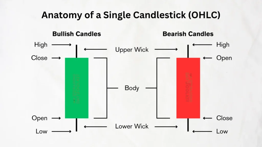
This is the thick, rectangular part in the middle. It’s the heart of the candle. Its top and bottom edges tell you where the price
Opened (started) at the beginning of that time period and where it Closed (ended) when that time period finished.
The Wicks (or Shadows): The Battle for the Highs and Lows
These are the thin lines sticking out from the top and bottom of the Real Body. Some traders call them “shadows” or “tails.”
- The very top tip of the upper wick shows you the absolute High price the asset reached during that period.
- The very bottom tip of the lower wick shows you the absolute Low price the asset reached during that period.
Putting It All Together: OHLC
So, just by looking at one candle—its body and its wicks—you instantly know the Open, High, Low, and Close price for that specific time chunk. This is often abbreviated as OHLC, a term you’ll see everywhere.
Decoding the Colors: The Battle Between Bulls & Bears
Now, why are candles different colors? (Usually green and red, but you can often customize them). The color gives you one crucial piece of information instantly: did the price end up higher or lower than where it started?
The Bullish Candle (Usually Green)
A bullish candle means the Close price was higher than the Open price. Buyers were stronger during this period, pushing the price up.
- Open: Bottom of the Real Body
- Close: Top of the Real Body
Think of it this way: Price opened, buyers took control, and it closed higher. A win for the bulls.
The Bearish Candle (Usually Red)
A bearish candle means the Close price was lower than the Open price. Sellers were stronger, pushing the price down.
- Open: Top of the Real Body
- Close: Bottom of the Real Body
Here, the price opened, but sellers wrestled control and forced it to close lower. A win for the bears.
What the Shapes Hint At (Just a Teaser!)
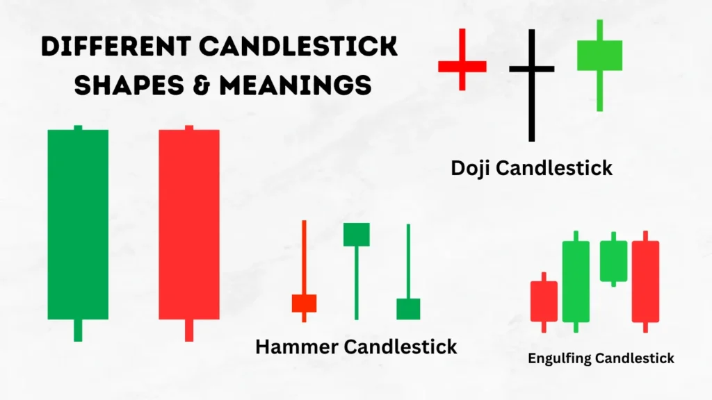
Okay, last point. You’ll start to notice that candles come in all sorts of shapes and sizes. Some have long bodies and tiny wicks; others have huge wicks and small bodies. These shapes give you little clues about the “battle” between buyers and sellers.
- A long, solid body with small wicks suggests one side was firmly in control. A long green body shows strong, decisive buying. A long red body shows strong, decisive selling.
- A small body with long wicks on both sides suggests a lot of back-and-forth—a real tug-of-war with no clear winner. This can signal indecision in the market.
BUT—and this is a big but—don’t get ahead of yourself! There are tons of named candlestick patterns (Dojis, Hammers, Engulfing patterns, etc.) that traders study. We are absolutely not going there today. Your only job right now is to get comfortable identifying the OHLC, Body, and Wicks on any single candle and knowing what its color means. That’s it!

A Crucial Word on Timeframes
It’s worth repeating: each candle represents a specific time period. A 5-minute chart shows you the detailed, short-term battle, while a daily chart zooms out to show you the bigger picture over many days. Most traders learn to look at multiple timeframes to get context, a topic we’ll explore later when we discuss technical analysis. For now, just know that the timeframe setting determines the story each candle tells.
You’ve Learned the Alphabet. Now What?
And that’s it! You now know how to read the ‘alphabet’ of price charts. You can look at any candlestick and identify its Open, High, Low, Close, Real Body, and Wicks, and understand what its color is telling you.
This skill might seem small, but it is the absolute bedrock for analyzing charts. It’s the first step to seeing the story of what happened, which is essential before you can ever make an educated guess about what might happen next. After you’ve mastered reading the candle, you can think about placing your trades.
Your homework: Pull up any stock chart. Set it to a 5-minute or 15-minute timeframe. Pick a random candle and, out loud, point out the open, high, low, and close. Was it a bullish or bearish candle? What does its shape tell you about the battle? Do this 20 times. Get comfortable with the language.
Frequently Asked Questions About Candlestick Charts
What are the 4 main parts of a candlestick?
QuicQuick Answer: The four main parts are the open, high, low, and close (OHLC).
The open is the price at the start of the period, and the close is the price at the end. The high is the highest point the price reached, and the low is the lowest point it reached during that period. These four data points are visualized through the candle’s body and wicks.
Key Takeaway: Every single candlestick, regardless of its shape or color, provides these four essential pieces of price information.
How do you read a green and red candlestick?
Quick Answer: A green (or bullish) candle means the price closed higher than it opened. A red (or bearish) candle means the price closed lower than it opened.
For a green candle, the bottom of the thick “real body” is the open, and the top is the close. For a red candle, the top of the body is the open, and the bottom is the close.
Key Takeaway: The color tells you the primary direction of price movement within that specific time period at a single glance.
What is the most important part of a candlestick?
Quick Answer: The relationship between the open and the close (the real body) is arguably the most important part.
The real body shows who won the battle for that period—buyers (green body) or sellers (red body)—and the size of the body indicates how decisive that victory was. A long body shows strength, while a tiny body shows indecision.
Key Takeaway: While wicks are important, the real body provides the clearest signal of momentum and control for that candle’s timeframe.
What do the wicks on a candlestick mean?
Quick Answer: Wicks (or shadows) show the full range of price exploration during the period, representing the highest and lowest prices reached.
Long wicks indicate a significant battle between buyers and sellers where price was pushed far from the open/close but ultimately rejected. This can signal volatility and indecision.
Key Takeaway: Wicks tell the story of the price extremes and where buyers or sellers failed to maintain control.
What is a bullish candle vs a bearish candle?
Quick Answer: A bullish candle is one where the closing price is higher than the opening price, typically colored green. A bearish candle is one where the closing price is lower than the opening price, typically colored red.
“Bullish” signifies buying pressure won for that period, while “bearish” signifies selling pressure won.
Key Takeaway: These terms describe the net outcome of the trading period represented by the candle.
How do you use candlestick charts for day trading?
Quick Answer: Day traders use day trading candlesticks on short timeframes (like 1-minute, 5-minute) to make quick decisions.
They analyze individual candles and sequences of candles (patterns) at key support and resistance levels to gauge real-time momentum and predict potential short-term price movements.
Key Takeaway: For day traders, candlestick charts are the primary tool for reading the immediate price action and sentiment.
What is the story a candlestick tells?
Quick Answer: A candlestick tells the story of the battle between buyers (bulls) and sellers (bears) within a specific time period.
The real body shows who won the battle (bulls or bears), the size of the body shows how decisively they won, and the wicks show the territory that both sides fought for but ultimately couldn’t hold.
Key Takeaway: Learning how to read candlestick charts is like learning to read the narrative of the market, one period at a time.
What timeframe is best for reading candlestick charts?
Quick Answer: There is no single “best” timeframe; it depends entirely on your trading style.
Day traders focus on shorter timeframes like the 1, 5, or 15-minute charts. Swing traders use longer timeframes like the 1-hour, 4-hour, and daily charts. It’s best to analyze multiple timeframes for context.
Key Takeaway: Start with a timeframe that suits your strategy (e.g., 5-minute for day trading) and get comfortable with it before adding multi-timeframe analysis.
What does the body of a candlestick tell you?
Quick Answer: The body represents the distance between the open and close price, showing the net price movement for the period.
A long body indicates strong momentum and a decisive win for either buyers (green) or sellers (red). A short body indicates little price movement and potential indecision.
Key Takeaway: The size of the real body is a direct visual measure of the strength behind the move for that period.
Can you explain OHLC in simple terms?
Quick Answer: OHLC stands for Open, High, Low, and Close, the four data points in every candlestick.
Open: First price of the period.
High: Highest price reached.
Low: Lowest price reached.
Close: Last price of the period.
Key Takeaway: OHLC data provides a complete summary of price activity for any given timeframe, which is why candlesticks are so informative.
Why are they called candlesticks?
Quick Answer: They are called candlesticks simply because their shape—a thicker “real body” with a thinner “wick” on top and/or bottom—resembles a traditional candle with a wick.
The name is purely descriptive of their appearance.
Key Takeaway: The name is a simple visual analogy for this powerful charting method.
Are candlestick charts reliable for beginners?
Quick Answer: Yes, they are one of the most reliable and intuitive ways for beginners to start reading price action.
Their visual nature makes it easier to see the relationship between the open, high, low, and close than other chart types. Mastering the basics of candlesticks is a foundational skill for all technical analysis.
Key Takeaway: While no chart is a crystal ball, candlestick charts offer a clear and powerful way to interpret market behavior. For a deeper dive, educational resources like StockCharts ChartSchool are excellent.
How do I start learning candlestick patterns?
Quick Answer: First, master reading a single candle perfectly. Once you are comfortable, you can begin to recognize very basic simple chart patterns involving two or three candles.
Don’t try to memorize dozens of patterns. Focus on understanding the psychology behind a few key reversal and continuation patterns.
Key Takeaway: Learn the alphabet (single candles) before you try to read words (patterns).
Does a big green candlestick mean buy?
Quick Answer: Not necessarily. A big green candle (called a Marubozu) indicates strong buying pressure during that period, but context is everything.
If it occurs after a long uptrend and slams into a major resistance level, it could signal exhaustion. If it breaks out of a consolidation pattern on high volume, it could be a strong buy signal.
Key Takeaway: A single candle is just one piece of data; never make a trading decision based on one candle alone without considering the broader context.
What is the difference between a bar chart and a candlestick chart?
Quick Answer: Both charts show the same OHLC data, but they visualize it differently.
A bar chart is a vertical line with small horizontal lines on the left (for the open) and right (for the close). A candlestick chart uses a thicker “real body” to represent the space between the open and close, making the price movement and direction much easier to see at a glance due to the color-filled body.
Key Takeaway: Most traders find candlestick charts more visually intuitive and easier to interpret quickly than bar charts.


