Every chart you’ve ever seen of a stock’s price — those little red and green rectangles stacked side by side — is telling a story. Not a vague, abstract story. A specific, scene-by-scene narrative of what happened between buyers and sellers during a precise window of time.
Most beginners look at a candlestick chart and see chaos. A jumble of shapes and colors that might as well be hieroglyphics. But here’s the thing about hieroglyphics — once someone teaches you the alphabet, the wall starts talking to you. That’s exactly what we’re going to do in this article.
If you’ve been following our Beginner’s Guide series, you’ve built your trading cockpit in Module 2 — hardware, broker, platform, screen layout, hot keys, and tools. Now we’re stepping into Module 3: learning to read the market. And it all starts here, with the single most important visual skill in trading.
Candlestick charts are the default chart type on virtually every trading platform in the world. They’ve been used for over 250 years. And they endure for one reason: they compress an enormous amount of information — the open, the close, the high, the low, the intensity of buying, the intensity of selling — into a single visual shape that your brain can process in a fraction of a second.
By the end of this article, you won’t just know what a candlestick is. You’ll be able to look at any candle on any chart and narrate what happened: who was winning, who was losing, and where the fight got interesting. That’s not pattern memorization. That’s reading comprehension. And it changes everything.
A 250-Year-Old Secret: Where Candlestick Charts Come From
Before we get technical, a quick story — because the origin of candlestick charts tells you something important about why they work.
In 18th-century Japan, the Dojima Rice Exchange in Osaka was one of the world’s first organized futures markets. Rice wasn’t just food — it was currency. Samurai were paid in rice. Fortunes rose and fell on rice prices.
A merchant named Munehisa Homma traded rice futures on this exchange and became legendary — some accounts estimate he amassed a fortune equivalent to over $10 billion in today’s money. What made him different wasn’t access or capital. It was his approach. Homma realized something that most of his competitors missed: price movements weren’t just about supply and demand. They were driven by human emotions — fear, greed, hope, and panic.
He began tracking price action in a visual format that captured not just where price ended up, but how it got there — the battle between buyers and sellers within each trading session. In 1755, he published The Fountain of Gold — The Three Monkey Record of Money, now considered the first book on market psychology. His charting technique, refined over decades, became the foundation of what we now call candlestick charts.
For centuries, this method stayed within Japan. It wasn’t until 1991, when American technical analyst Steve Nison published Japanese Candlestick Charting Techniques, that the Western world adopted them. Within a decade, candlestick charts had become the global standard for price visualization.
Why does this history matter? Because it tells you the purpose of a candlestick. It’s not just a data display. It’s a psychological snapshot — a picture of the emotional battle between buyers and sellers during a specific period of time. When you read a candlestick correctly, you’re reading market psychology. And that psychology hasn’t changed in 250 years.
What Is a Candlestick Chart? (And Why Traders Prefer It Over Line Charts)
A candlestick chart is a type of price chart where each “candle” represents the price movement of an asset during a specific time period, showing four key data points: the opening price, the closing price, the highest price, and the lowest price.
That might sound dry. So let’s make it concrete with a comparison.
Line Charts: The Headline
A line chart shows you only the closing price at the end of each time period. It draws a single line connecting close to close. Think of it as a newspaper headline: “Stock closed at $50.”
That’s useful information. But it tells you nothing about what happened during the day. Did the stock open at $45 and rally steadily to $50? Or did it open at $55, crash to $42, then fight back to close at $50? Those are radically different stories with radically different implications — and a line chart hides both of them behind the same dot.
Bar Charts: The Summary
A bar chart adds more data. Each vertical bar shows the high and low (the range of the bar), with small horizontal ticks marking the open (left tick) and close (right tick). It contains all four data points. But honestly? It’s not the easiest thing to read quickly. The open and close ticks are small, the direction isn’t color-coded, and scanning a chart full of bars takes mental effort.
Candlestick Charts: The Full Story
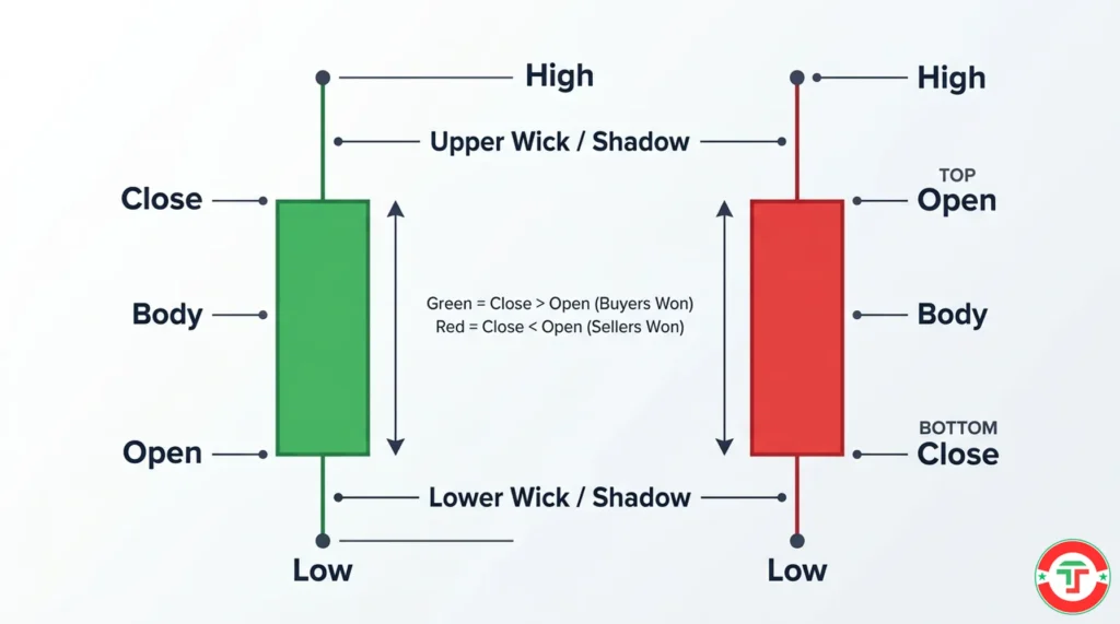
A candlestick chart contains the exact same four data points as a bar chart — open, high, low, close — but packages them in a way that your brain can absorb instantly. The thick, colored body shows you the range between open and close. The thin lines extending above and below (the wicks) show you the high and low. And the color tells you the direction: green (or hollow/white) means the close was above the open — price went up. Red (or filled/black) means the close was below the open — price went down.
The result? You can glance at a candlestick chart and immediately see: Was this period bullish — meaning buyers were in control and price moved up — or bearish — meaning sellers dominated and price moved down? How intense was the move? Was there a fight? Who tried and failed?
That’s why candlestick charts are the default on every professional trading platform. They turn raw price data into a visual language that tells the story at a glance.
Anatomy of a Single Candlestick: The 4 Pieces of Data That Tell the Story
Every single candlestick, regardless of color or size, contains exactly four pieces of information. Think of them as the who, what, where, and when of that time period’s price action.
The Open
This is where price started when the candle’s time period began. If you’re looking at a 5-minute candle, the open is the first traded price in that 5-minute window. If it’s a daily candle, the open is the price at the first trade of the day.
The Close
This is where price ended when the candle’s time period finished. The close is arguably the most important data point because it represents the final verdict — after all the buying and selling, after all the fighting, this is where the market settled.
The High
The highest price reached at any point during that time period. Even if price only touched that level for a split second before being pushed back down, the candle records it.
The Low
The lowest price reached at any point during that time period. Same logic as the high — even a brief touch counts.
How These Create the Candle Shape
The body is the thick rectangular portion of the candle. It represents the range between the open and the close. A green body means the close is above the open (buyers won). A red body means the close is below the open (sellers won).
The upper wick (also called the upper shadow) is the thin line extending above the body. It stretches from the top of the body to the high. It represents the territory that buyers claimed during the period but couldn’t hold — price reached up there but was pushed back down.
The lower wick (also called the lower shadow) is the thin line extending below the body. It stretches from the bottom of the body to the low. It represents the territory that sellers pushed price into but couldn’t hold — price reached down there but was pushed back up.
Here’s the mental model that makes all of this click: the body is the final score. The wicks are the battle that happened before the final score was decided.
Reading the Body: The Battle Between Buyers and Sellers
The body of a candlestick tells you two things: who won (color) and how decisively they won (size).
Color = Who Won This Period
- Green (bullish) body: The close is higher than the open. Buyers controlled this period. Price ended higher than it started.
- Red (bearish) body: The close is lower than the open. Sellers controlled this period. Price ended lower than it started.
Simple. But here’s what most beginners miss: the size of the body matters just as much as the color.
Body Size = Intensity of Conviction
Large body: Strong conviction. Either buyers or sellers dominated decisively. A large green body means buyers overwhelmed sellers — price moved up aggressively and stayed up. A large red body means sellers overwhelmed buyers — price moved down hard and stayed down. When you see a large body, the market is making a clear statement.
Small body: Weak conviction or indecision. Buyers and sellers were roughly evenly matched. The open and close are close together, meaning despite all the trading that happened during this period, nobody really won. Small bodies often appear during consolidation — when the market is “catching its breath” before the next move.
No body (or nearly no body): Extreme indecision. The open and close are at virtually the same price. This creates what’s called a Doji — a candle that’s essentially just a cross or plus sign. Dojis are powerful signals that the current trend may be losing steam. We’ll cover them in the single-candle types section below.
Here’s a practical way to think about body size. Imagine two boxers in a ring. A large body means one fighter threw a devastating combination and the other barely got a punch in — it’s a decisive round. A small body means both fighters landed shots, neither gained an advantage — the round could go either way. No body? They circled each other the entire round, throwing nothing. Stalemate.
Reading the Wicks: What Price Rejection Actually Looks Like
Wicks are where the real psychology lives. If the body is the final score, the wicks are the story of the comeback, the failed rally, or the rejected attempt.
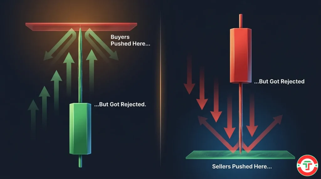
The Upper Wick: “Buyers Tried and Failed”
A long upper wick tells you that during this time period, buyers pushed price significantly higher — but they couldn’t hold that ground. Sellers fought back and pushed price down from its high before the candle closed.
The longer the upper wick relative to the body, the more dramatic the rejection. Think of it as a basketball team that was up by 20 points at halftime but lost the lead by the final buzzer. They tried. They had momentum. And they lost it. That information — the failure — is often more important than the final score itself.
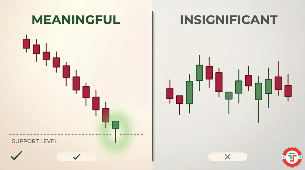
What it suggests: Selling pressure exists at higher prices. Buyers are running into resistance — a price level where sellers step in and push back. We cover support and resistance in the next article in this series: Finding Support and Resistance Levels.
The Lower Wick: “Sellers Tried and Failed”
A long lower wick is the mirror image. Sellers pushed price significantly lower during the period, but buyers stepped in and pushed price back up before the close. The sellers had their moment — and lost it.
What it suggests: Buying interest exists at lower prices. Sellers are running into a floor — a support level — where buyers consider the stock “cheap enough” and start buying.
Wick Length Matters
Long wicks: Dramatic rejection. Price moved far in one direction before being pushed back. This signals strong opposing pressure. Long upper wicks near price highs are warning signs of potential reversals. Long lower wicks near price lows can signal potential bounces.
Short wicks: Minimal rejection. Price didn’t venture far beyond the body in either direction. The open-to-close range was close to the full range of the period. This means whoever was in control — buyers or sellers — maintained control from start to finish with little pushback.
No wicks: Total domination. The open was the low (for a green candle) or the high (for a red candle), and the close was the high (green) or the low (red). One side controlled the entire period from the very first trade to the very last, with zero pushback. These are called Marubozu candles, and they represent the strongest possible conviction. We’ll cover them next.
Putting It All Together: Narrating a Candle
Here’s where reading becomes a skill. Let’s practice.
Imagine a 5-minute candle on a stock that opened at $25.00. During those 5 minutes, price spiked to $25.80, then dropped to $24.50, and closed at $24.60. The candle is red (close below open) with a very long upper wick, a short lower wick, and a small-to-medium red body.
The narrative: “Buyers opened strong and pushed price up 80 cents in the first minute or two — aggressive buying. But then sellers came in hard, overpowered the buyers, pushed price below the open AND kept pushing to $24.50. Price recovered slightly to close at $24.60, but the message is clear: this was a dramatic seller victory despite an early buyer push. That long upper wick is a warning — the buyers who bought near $25.80 are now trapped.”
That’s reading a candlestick. Not memorizing a pattern name — understanding what happened.
The 5 Single-Candle Types Every Beginner Must Recognize
There are dozens of named candlestick patterns. We’re going to teach you five. That’s it. These five single-candle types cover the fundamental vocabulary you need to start reading charts. More complex multi-candle patterns — like engulfing patterns, morning stars, and evening stars — are covered in our Chart Patterns guide later in the series.
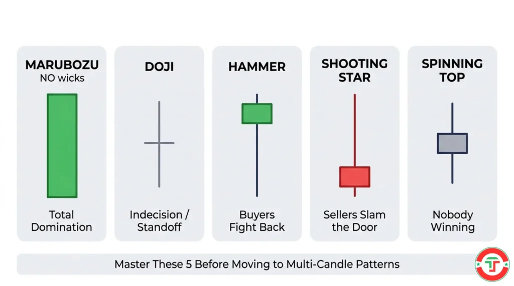
1. The Marubozu: Total Domination
A Marubozu is a candle with a large body and no wicks — or nearly no wicks. The open is at one extreme and the close is at the other.
- Bullish Marubozu (green): Opened at the low, closed at the high. Buyers controlled every single second of this period. Zero pushback from sellers. This is the strongest possible bullish candle.
- Bearish Marubozu (red): Opened at the high, closed at the low. Sellers controlled every second. Zero pushback from buyers. Strongest possible bearish candle.
What it tells you: One side is in complete command. When you see a Marubozu, the market is making a loud, unambiguous statement. There’s no confusion, no indecision — just pure directional conviction.
Day trading context: A bullish Marubozu on a 5-minute chart during the first candle after market open, on high volume, is a very strong signal that the stock has momentum. Buyers aren’t hesitating.
2. The Doji: The Standoff
A Doji forms when the open and close are at virtually the same price — the body is a thin horizontal line or nearly invisible. The wicks can vary in length, creating different sub-types, but the core message is the same: indecision.
Neither buyers nor sellers could gain a meaningful advantage during this period. The market is paused, thinking, unsure.
What it tells you: The current trend may be losing momentum. A Doji after a long uptrend suggests that buyers are exhausted and sellers are starting to push back. A Doji after a long downtrend suggests that sellers are running out of steam. It’s a yellow traffic light — not a reversal by itself, but a warning to pay attention.
Day trading context: If a stock has been ripping higher on 5-minute candles and suddenly prints a Doji, that’s your signal to tighten your stop or start thinking about taking profit. The buyers who’ve been in control just had their first stalemate.
3. The Hammer: Buyers Fight Back from Below
A Hammer has a small body at or near the top of the candle, a long lower wick (at least twice the length of the body), and little to no upper wick.
Here’s the story it tells: during this period, sellers pushed price dramatically lower — the long lower wick shows just how far down it went. But then buyers stepped in and pushed price almost all the way back up, closing near the open or even above it. The sellers had their shot and failed.
What it tells you: When a Hammer appears at the bottom of a downtrend, it’s a potential reversal signal. It suggests that selling pressure is being absorbed by buyers. The “floor” held.
Important: A Hammer only matters at the bottom of a decline. The exact same shape at the top of an uptrend has a different name and a different meaning — it’s called a Hanging Man, and it’s actually a bearish warning signal. Context is everything. We’ll cover this more in the next section.
Day trading context: If a stock has been selling off for 30 minutes and then prints a Hammer on the 5-minute chart — especially near a known support level — that’s a signal worth watching. The sellers tried to push it lower and got rejected.
4. The Shooting Star: Sellers Slam the Door from Above
A Shooting Star is the inverse of the Hammer. It has a small body at or near the bottom of the candle, a long upper wick (at least twice the body), and little to no lower wick.
The story: buyers pushed price dramatically higher during this period — the long upper wick shows their ambition. But sellers came in and crushed the rally, pushing price back down to close near the open or below it. The buyers reached for the sky and got swatted down.
What it tells you: When a Shooting Star appears at the top of an uptrend, it’s a potential reversal signal. Buyers tried to continue the rally, but sellers rejected the higher prices emphatically.
Day trading context: A stock has been climbing all morning. On the 5-minute chart, a candle forms with a massive upper wick — price spiked up 30 cents but gave it all back. That Shooting Star is your warning that the upside momentum may be fading. The ceiling was tested and held.
5. The Spinning Top: Nobody’s Winning
A Spinning Top has a small body — either color — with wicks extending on both sides. Unlike the Doji, the body has some size, so the open and close aren’t identical. But the body is small relative to the total range, and both wicks are visible.
What it tells you: Indecision, similar to a Doji, but slightly less extreme. Both buyers and sellers were active during this period. Price moved up, moved down, and closed somewhere near the middle. The market is confused. Neither side has conviction.
Day trading context: A series of Spinning Tops during midday (the “chop zone” between 11 AM and 2 PM) is a classic sign that the market is directionless. This is often a signal to stop trading and wait for clearer price action — a lesson we’ll revisit when we cover adapting to market conditions later in the series.
Why Context Matters: A Candle Means Nothing Alone
This is the single most important thing we can tell you about candlestick charts: no individual candle has meaning without context.
A Hammer at the bottom of a 2-hour downtrend might signal a reversal. A Hammer in the middle of a strong uptrend? Barely noteworthy. A Doji after 10 consecutive green candles is a warning sign. A Doji in the middle of a sideways range? Just more chop.
Where the Candle Appears Matters More Than What It Looks Like
The same candle shape can mean completely different things depending on:
Its position in the trend. A Shooting Star at a 52-week high is a much stronger bearish signal than a Shooting Star in the middle of nowhere. A Hammer at a well-known support level is far more significant than one floating in the middle of a range.
What happened before it. A Doji after 8 large green candles in a row tells a very different story than a Doji after 3 mixed candles. Context is the sequence of candles leading up to the one you’re analyzing.
Volume. A Hammer on heavy volume — meaning lots of traders participated in that reversal — carries more weight than a Hammer on thin volume where barely anyone was trading. We cover volume analysis in depth in our Volume Analysis guide.
The Common Beginner Mistake
New traders learn candlestick types and immediately start looking for them everywhere. “I see a Hammer! Buy!” No. A Hammer is a clue, not a command. It’s one piece of evidence in a larger case. You wouldn’t convict someone based on a single fingerprint found at the grocery store. You need a fingerprint at the crime scene, matching the suspect, with a motive.
Candlestick patterns work the same way. The pattern tells you to pay attention. The context tells you whether to act. As you continue through this series, you’ll add more context tools — support and resistance levels, indicators, volume — that help you build stronger cases for your trades.
How to Practice Reading Candlestick Charts (Right Now, for Free)
Reading candlesticks is a visual skill, which means it develops through repetition, not just reading. Here’s how to practice.
Exercise 1: The Daily Chart Narration
Open any free charting platform — TradingView’s free tier works perfectly for this. We compare charting options in our Day Trading Toolkit. Pull up a daily chart of a stock you recognize — Apple, Tesla, Amazon, anything.
Look at the last 20 candles. For each one, narrate the story out loud or in your head:
- “This big green candle — buyers dominated. Price opened near the low and closed near the high. Strong bullish day.”
- “This small red candle with a long lower wick — sellers pushed price down early, but buyers fought back. Sellers won by a hair, but just barely.”
- “This Doji — nobody won. After three green days, the market paused.”
Exercise 2: The 5-Minute Challenge
Switch to a 5-minute chart of the same stock. Look at the first 30 minutes after market open (9:30–10:00 AM). This is the most volatile period of the trading day and produces the most dramatic candlestick shapes.
Try to identify:
- The largest body candle — who was in complete control?
- Any candles with long upper wicks — where did sellers reject buyers?
- Any candles with long lower wicks — where did buyers reject sellers?
- Any Doji or Spinning Top candles — where was the market undecided?
Exercise 3: The “Cover and Predict” Game
This one builds real analytical skill. Pull up a 5-minute chart. Cover the right half of the screen with your hand (or use a blank card). Look at the last candle visible and ask: “Based on this candle’s shape — the body size, the wick lengths, the color — what do I think might happen next?”
Then move the card to reveal the next candle. Were you right? Wrong? Were there clues you missed?
This isn’t about being right. It’s about training your brain to extract information from candlestick shapes. The more you practice, the more intuitive it becomes — like learning to read a foreign language. Clunky and conscious at first, then gradually automatic.
Exercise 4: The Screenshot Journal
As you practice, screenshot 3-5 interesting candles each day and paste them into your trading journal — which you set up using a simple spreadsheet, as we discussed in our Free vs. Paid Trading Tools guide. Under each screenshot, write a short narration of what the candle tells you. After two weeks, you’ll be amazed at how much faster you read charts.
What’s Next in Your Day Trading Journey
You now have the foundational skill that everything else builds on. You can look at any single candle and understand what happened — who was winning, how decisively, and where the fight got interesting. That’s the alphabet.
The next step is learning where these candles matter most — the price levels where buyers and sellers draw their lines in the sand. Support and resistance are the most fundamental concepts in technical analysis, and once you combine them with your candlestick reading skills, charts start making sense on a completely different level.
→ Next Article: A Beginner’s Guide to Finding Support and Resistance Levels
Frequently Asked Questions
What is a candlestick chart?
Quick Answer: A candlestick chart is a type of price chart where each “candle” represents the price movement during a specific time period, showing four data points: the open, close, high, and low.
The thick body of each candle shows the range between the opening and closing price, while the thin lines (wicks or shadows) extending above and below show the highest and lowest prices reached during that period. A green body means the close was higher than the open (bullish — buyers won), and a red body means the close was lower than the open (bearish — sellers won). Candlestick charts originated in 18th-century Japan and became the global standard for price visualization because they compress complex price data into shapes your brain can process almost instantly. They’re the default chart type on virtually every trading platform.
Key Takeaway: Candlestick charts show you not just where price ended, but the entire story of how it got there — making them far more informative than simple line charts.
How do you read a candlestick chart?
Quick Answer: Read the body for who won (color) and how decisively (size), then read the wicks for price rejection — where buyers or sellers tried to push price but failed.
Start with the body: green means buyers won this period, red means sellers won. A large body means one side dominated; a small body means it was a close fight. Then look at the wicks: a long upper wick means buyers pushed price higher but got rejected — sellers fought back. A long lower wick means sellers pushed price lower but got rejected — buyers stepped in. The combination of body size, body color, and wick lengths tells you the complete story of what happened during that time period. With practice, reading candles becomes automatic.
Key Takeaway: Body = final score (who won and by how much). Wicks = the battle (where price tried to go but got rejected).
What do the wicks (shadows) on a candlestick mean?
Quick Answer: Wicks represent price rejection — the parts of the price range that were reached during the period but couldn’t be held by the close.
A long upper wick means price spiked higher during the period but sellers pushed it back down before the close. This indicates selling pressure at higher prices. A long lower wick means price dropped lower but buyers pushed it back up — indicating buying interest at lower prices. The longer the wick relative to the body, the more dramatic the rejection. Short wicks mean whoever was in control maintained control throughout the period with little opposition. No wicks at all (a Marubozu) means one side dominated from the first trade to the last with zero pushback.
Key Takeaway: Wicks are failed attempts — they show you where the opposing side drew the line and fought back, which often marks important price levels.
What’s the difference between a green and red candlestick?
Quick Answer: A green candlestick means the closing price was higher than the opening price (bullish period), while a red candlestick means the closing price was lower than the opening price (bearish period).
Color tells you the direction but not the full story. A small green candle barely above its open indicates a very weak bullish period — buyers won by a hair. A massive green candle with no wicks indicates explosive, uncontested buying. Similarly, a small red candle suggests mild selling, while a large red candle with no wicks shows aggressive, unchallenged selling. Always combine color with body size and wick analysis for the complete picture. Some platforms use white/black or hollow/filled instead of green/red, but the principle is identical.
Key Takeaway: Green = buyers won, red = sellers won — but the size of the body and the length of the wicks tell you how they won, which matters far more.
What are the most important candlestick types for beginners?
Quick Answer: Beginners should learn five single-candle types first: Marubozu (total domination), Doji (indecision), Hammer (buyer reversal), Shooting Star (seller reversal), and Spinning Top (nobody winning).
These five types cover the fundamental vocabulary of candlestick reading. The Marubozu shows you what complete control looks like. The Doji shows you indecision and potential trend exhaustion. The Hammer and Shooting Star show you reversal potential at key turning points. The Spinning Top shows you confusion and directionlessness. Once these five feel automatic, you can move on to multi-candle patterns like engulfing patterns and morning/evening stars, which we cover in our Chart Patterns guide.
Key Takeaway: Master five single-candle types before learning multi-candle patterns — depth of understanding beats breadth of memorization every time.
What timeframe should I use for candlestick charts?
Quick Answer: Each candle represents one time period — a 1-minute candle shows one minute of trading, a 5-minute candle shows five minutes, and a daily candle shows the full trading day.
For day trading, the most common timeframes are 1-minute and 5-minute candles for trade execution and 15-minute or daily candles for broader context. A candle on a 5-minute chart compresses five minutes of buying and selling into a single shape. The same stock at the same moment will look different on a 1-minute chart versus a daily chart because each timeframe aggregates a different amount of trading activity. Choosing the right timeframe depends on your trading style, which we cover in detail in our Chart Timeframes guide.
Key Takeaway: Start practicing with 5-minute charts — they’re the most common timeframe for day traders and balance detail with readability.
Do candlestick patterns really work?
Quick Answer: Individual candlestick patterns are clues, not guarantees. They work best when combined with other analysis — context, support/resistance levels, volume, and broader trend direction.
No single candlestick pattern predicts the future with certainty. A Hammer at the bottom of a downtrend near a strong support level with heavy volume is a much more reliable signal than a Hammer appearing randomly in the middle of a chart. The patterns are useful because they capture real market psychology — the battle between buyers and sellers — and that psychology repeats. But they’re one tool in a larger toolkit. The traders who succeed with candlestick analysis are the ones who use patterns as evidence within a broader case, not as isolated buy/sell triggers.
Key Takeaway: Candlestick patterns work as part of a system, not in isolation. Always look for confluence — multiple signals pointing in the same direction.
What is a Doji candlestick?
Quick Answer: A Doji forms when the open and close are at virtually the same price, creating a candle with a very thin or invisible body — signaling indecision between buyers and sellers.
The Doji is one of the most important single-candle signals because it tells you the market is pausing. After a strong uptrend, a Doji suggests buyers may be losing steam. After a strong downtrend, it suggests sellers may be running out of momentum. The length of the Doji’s wicks matters: long wicks mean there was a big fight during the period even though nobody won, while short wicks mean the period was simply quiet. A Doji isn’t a reversal signal by itself — it’s a warning to pay attention and watch the next few candles closely for confirmation.
Key Takeaway: A Doji is a “pause” signal — the trend may be about to change, but always wait for the next candle to confirm before acting.
What’s the difference between a Hammer and a Shooting Star?
Quick Answer: A Hammer has a long lower wick and small body at the top (bullish reversal signal at bottoms), while a Shooting Star has a long upper wick and small body at the bottom (bearish reversal signal at tops). They’re essentially mirror images.
Both patterns show dramatic price rejection. A Hammer tells you that sellers pushed price down aggressively but buyers fought all the way back — suggesting the selling is exhausted. A Shooting Star tells you that buyers pushed price up aggressively but sellers slammed it back down — suggesting the buying is exhausted. The critical difference is where they appear: Hammers matter at the bottom of downtrends, Shooting Stars matter at the top of uptrends. The same candle shape in the wrong location is far less meaningful.
Key Takeaway: Same concept (price rejection), opposite directions — a Hammer shows buying strength at the bottom, a Shooting Star shows selling strength at the top.
How long does it take to learn to read candlestick charts?
Quick Answer: Most beginners can learn the basic anatomy and five essential candle types in a single study session. Developing the skill to read candles fluently — quickly and automatically — takes 2-4 weeks of daily practice.
Learning what a candlestick is takes minutes. Learning to read them — to glance at a candle and instantly narrate what happened between buyers and sellers — takes repetition. The best practice method is to open a chart daily and narrate 10-20 candles out loud, describing the body size, wick lengths, and the story they tell. After a few weeks of this, you’ll start seeing candles not as shapes but as stories. That’s the shift from knowledge to skill, and it’s what separates traders who understand candlestick charts from traders who can actually use them.
Key Takeaway: Learn the concepts in one session, practice daily for 2-4 weeks, and the skill becomes automatic — like learning to read in a new language.
Disclaimer
The information provided in this article is for educational purposes only and should not be considered financial advice. Day trading involves substantial risk and is not suitable for every investor. Past performance is not indicative of future results.
For our complete disclaimer, please visit: https://daytradingtoolkit.com/disclaimer/
Article Sources
Our team referenced the following authoritative sources to build this introduction to candlestick charts. These resources provide additional depth on candlestick history, anatomy, and patterns for traders looking to go deeper.
- StockCharts ChartSchool: Introduction to Candlesticks — Comprehensive educational reference on candlestick formation, body/shadow interpretation, and basic pattern identification
- Investopedia: Candlestick Chart — Clear definition and explanation of candlestick components, reading techniques, and common patterns for beginner traders
- Britannica Money: Candlestick Patterns Explained — Authoritative overview of candlestick chart history, anatomy, and pattern significance with professional-grade visual references
- Wikipedia: Honma Munehisa — Historical reference on the 18th-century Japanese rice merchant credited with developing candlestick charting and authoring the first book on market psychology
- Steve Nison, Japanese Candlestick Charting Techniques (John Wiley & Sons, 1991) — The seminal book that introduced Japanese candlestick charting to Western financial markets, widely considered the definitive English-language reference on the subject
- CME Group: Introduction to Technical Analysis — CME Group’s educational module covering chart types including candlestick charts, pattern recognition, and technical analysis fundamentals


